
Principal Components Analysis
We are now ready to enter the last two phases of this tutorial on image display and interpretation. We will embark first on a quick-tour-through images produced by PCA or Principal Components Analysis (PCA). In producing these, we used all seven bands and requested that all seven components be generated (the number of components is fixed by the number of bands, because they must be equal). The first Principal Component explains the maximum amount of variation in the 7-dimensional space defined by the seven Thematic Mapper bands. We now look at each of these components, keeping in mind that many of the tonal patterns in individual components do not seem to spatially match specific features or classes identified in the TM bands and represent linear combinations of the original values instead.We make only limited comments on the nature of those patterns that lend themselves to some interpretation.
1-14: After reading through the special review of PCA accessed by link, plus the above paragraph, see if you can come up with a single key word (or perhaps a key idea in several words) that describes the main benefit from using Principal Components Analysis. ANSWER
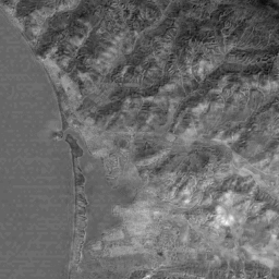
The image produced from PC 1 data commonly resembles an actual aerial photograph.
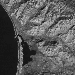
In fact, this is the normal character of the first component, in that it broadly simulates standard black and white photography and it contains most of the pertinent information inherent to a scene. The hills appear more realistic because the sharp light-dark contrast in most TM bands is subdued. Note the internal structure of the waves and the absence of any indication of sediment load in the sea. The histogram of the first PC shows two peaks. The first, on the left,constitutes the ocean pixels and the second one, to the right, the land pixels.
1-15: Describe this image relative to, say, the histogram-equalization stretched image seen on the previous page. ANSWER
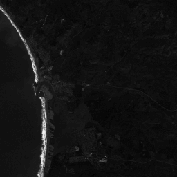
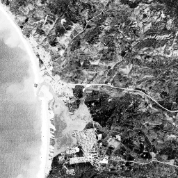
When we look at the histogram of the second PC, we see that even though the total range (maximum value - minimum value) is greater than for the first PC, most of the pixels fall in a small range around the mean of 49. Thus as is the convention the second PC has a smaller variance (variance is standard deviation squared) than the first PC. Since the bulk of the pixels falls in such a narrow range, the image does not display well (below left). In order to make the image viewable (below right), we expand (stretch numerically) it and then apply a histogram equalization to the results. This procedure (histogram equalization) produces a histogram where the space between the most frequent values is increased and the less frequent values are combined and compressed. If we had not done this transformation, the image would appear tonally flat as above, with only two gray levels defining most of the land surfaces and one gray level defining the ocean. However, the distinctions that were previously small are now magnified and easier to see on the computer display. The breaker waves are uniquely singled out as very bright.
1-16: Make some general observations on how the tonal patterns in PC 2 differ from patterns observed in, for instance, Band TM 3. ANSWER
Much of the gray patterns in the PC3 image below can be broadly correlated with two combined classes of vegetation:
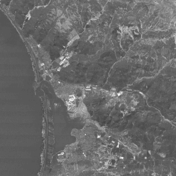
the brighter tones come from the fairways in the golf course and many of the agricultural fields. Moderately darker tones coincide with some of the grasslands, forest or tree areas, and coastal marshland.
The breakers completely disappear in the PC4 image below while the rest of the scene is rather flat with several patterns set forth in medium grays.
1-17: Anything unusual about PC 4 that might be meaningful? ANSWER
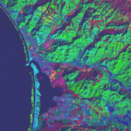
Any three of these four PC images can be made into color composites with various assignments of blue, green, and red. In all, 24 different combinations are possible. Of those made experimentally for this review, this next image composed of PC 4 = blue, PC 1 = green, and PC 3 = red has proved the most interesting. In this rendition, the golf course has a singular color signature (orange-red) and a unique internal structure. Most other vegetation shows as red to purple-red tones, but the grasslands (v) has an unusual color, describable as greenish-orange. The brighter slopes of the hills and mountains appear as medium green, while some areas in shadow, are bluish. The urban areas also have a deep blue color. The beach bar now appears as turquoise and the adjacent breakers are olive-green.

Primary Author: Nicholas M. Short, Sr. email: nmshort@epix.net
Collaborators: Code 935 NASA GSFC, GST, USAF Academy
Contributor Information
Last Updated: September '99
Webmaster: Bill Dickinson Jr.
Site Curator: Nannette Fekete
Please direct any comments to rstweb@gst.com.