
The interrelations among variables can be incredibly complex. To control the production process, we formulate a model for crop growth that accounts for the dynamic interactions and cause-effect responses of the appropriate factors. A model in this context establishes the functions, sequences, and feedback effects of the determining variables in the vigorous operation of a system.
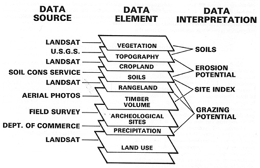
As evident from the above diagram, we take information from various conventional sources, along with data from Landsat or similar Earth-observing satellites, and often combine it to produce data elements, which we further convolve to produce interpretation maps and other output types. Then these outputs become viable parts of environmental resource planning, site selection, and other outcomes that benefit from modeling.
Interpretative maps are derivative, i.e., they result from decisions to produce new object categories, stemming from combinations of several others. For example, a map may plot the likelihood of runoff erosion, which we can deduce from maps showing soil properties, topography, rainfall, stream patterns, and other related factors. Variants of this map type are allocative or suitability maps (e.g., transportation routing), evaluative maps (e.g., earthquake damage potential), and predictive maps (e.g., 100-year flood coverage).
15-5: Let's say that you have, during one of your vacations in the western desert, found some enticing but still elusive evidence that an area you traversed during a hike had some unusual surface expressions of possible minable silver ore in a body near, but below, the surface. State some appropriate steps you would take to end up with a Data Interpretation map that you could use to persuade some investors to help you "stake a claim" and then develop the ore body. ANSWER
Until the 1970s, the traditional way of using geospatial data, making decisions based on combining information sources, and applying models by laying maps on a table was cumbersome. Interpreters inspected these maps individually, and mentally compared data sets - visual and tabular - while seeking to narrow parts of an area to locations that they pinpointed as suitable on several defining maps. In principle, they could physically overlay two or three maps, treating several relevant themes by placing them on a light table (particularly if they were rephotographed as transparencies) to check on pre-selected, favorable conditions, where patterns on the maps superposed in a positive way. This is, of course, inherently unwieldy and inefficient, and often the interpreter would simply glance back and forth between maps. They could improve the interrelationship process by laying a grid over each map and extracting information according to some relative merit or weighting, organized by location within the grid. Managing these data, usually in tables, proved labor-intensive, slow, and often ineffective.
Devices were developed to allow more systematic comparisons between maps. These comparisons occurred on a one-to-one basis by superimposing maps and photographs through an optical projector that allowed for differences in scale and even projection. One such device, still in use today, is the Zoom Transfer Scope (ZTS) manufactured by Bausch & Lomb.
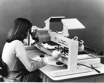
The operator mounts a photo or a map at one level of the ZTS and manipulates mirrors and lenses so that its image, projected through prisms, appears to register (align) in the view scope over a second map or photo at the bottom. The operator then draws tracings from the first map/photo on a thin sheet over the second one or takes a photograph using a polaroid camera within the optical train, in which the two views merge. We show here an illustration of this, in which an operator initially rephotographed a standard road map (at 1:500,000), so that all black or colored lines appear white, and then projected it through the ZTS onto a 1:1,000,000 print of a Landsat false color composite, showing Philadelphia, PA, and Trenton, NJ:
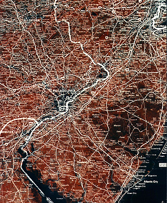
Obviously, this form of image combination is severely limited to two images. However, one or more additional layers are feasible, if we display map and photo reproductions in other colors, but multiple registration becomes difficult.

Primary Author: Nicholas M. Short, Sr. email: nmshort@epix.net
Collaborators: Code 935 NASA GSFC, GST, USAF Academy
Contributor Information
Last Updated: September '99
Webmaster: Bill Dickinson Jr.
Site Curator: Nannette Fekete
Please direct any comments to rstweb@gst.com.