
We extracted (with permission) the following from an example in the Database Query section of the Tutorial Exercises in the IDRISI for Windows Users Guide. This simplified example contains only a few of the many data elements that we normally consider using in the model. It does illustrate the workings and rationale underlying a GIS in operation. To manipulate data easily, it also relies on a different ranking mode within each element, which reduces to acceptable (1) versus not-acceptable (0).
The problem is identifying the best areas for planting a specific crop within a valley along the north side of the Senegal River at the border between Mauritania and Senegal, two West African nations along the Atlantic Ocean. The cereal crop is sorghum, a tall grass cultivated in tropical climates that yields grains suited as silage and fodder or, in some varieties, a cane sugar-like juice called sorgo. Many of the factors in the list on the second page of this section, pertaining to agricultural siting, apply in this case as well, but here, we consider only key ones, such as, soil types, relief, and periodic flooding (which promotes sorghum growth).
This following flow chart outlines the sequence of steps for using GIS to automate the decision about suitable areas:
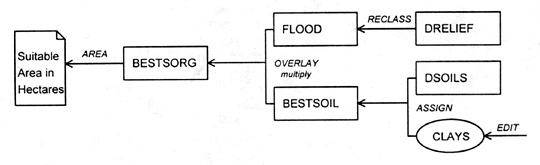
(NOTE: In the graphics that illustrate these steps, we leave off the legend created by the IDRISI program, because there is no provision to copy it when the we convert the image to a ".tif" format. We identify the category color(s) for each graphic in the text.)
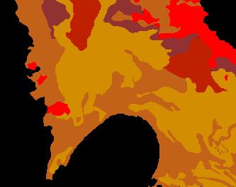
The first factor is the elevation variations or relief . Field surveys have led to a digital elevation model (DEM) data set, from which we produced this general topographic map image (three-meter contour interval) (DRELIEF in the flow chart is just the file name, as are the others):
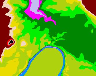
(The sequence of increasing elevations, as color-coded is: blue (lowest, associated with the river), medium gray, purple-red, dark green, medium green, olive, yellow, tan, brown, red, darker gray, and black.)
15-9: There seems to be something strange about this elevation map. The river is the lowest part of the scene, yet it appears to back up against the medium green pattern. What gives? ANSWER
The relief or range of elevations in this scene is 33 m (about 108 ft), stamping the local region as relatively low. Gentle hills occur in the west and northeast sections. A lowlands extends across the river, with an unusual lower area (a gully?) shown in the north center of the image. This depression controls the location and retention of water during floods that take place routinely during the rainy season. Flood stages can reach 9 m (30 ft) above the normal stream level. Using this elevation range as a constraint, we used an IDRISI routine, called RECLASS, that gives boolean algebra values of 0 and 1 to other ranges of values, to produce an image (named FLOOD) that defines the area of flooding (in blue). Here, we assigned 1 to all elevation values (in blue) less than 9 m, i.e., those prone to flooding, and 0 to all values above this level (rendered in black in the image).
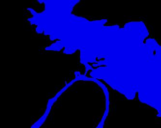
15-10: Why is the area beyond the river flooded where it is in the pattern map? ANSWER
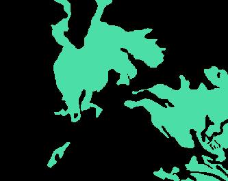
During this stage, the soil types in the region differentially absorb floodwaters, such that, some retain enough over the long term to provide a continuing supply of moisture during the growing season. Thus, soil type is another critical factor. Here is a map (DSOILS) of the distribution of five soils within the region:
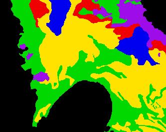
In this map, blue = heavy soils (1); yellow = clays (2); red = sandy clays (3); green = levee soils (4); purple = stony soils (5). The IDRISI program allows us to give each soil a suitability ranking, as follows: best (5) = clays, then in decreasing quality, levee soils (4), sandy clays (3), heavy clays (2) and worst, stony soils (1). The black areas are not considered further, for other reasons. Now, the trick becomes that of producing a map (SORGSUIT), in which we rate the soils by suitability, using the IDRISI ASSIGN program:
In this map, red = 1 (least suitable); brown = 2; dark brown = 3; yellow brown (most suitable) = 4; black = 5 (not considered). Clearly, this map has the same distribution pattern as the soils map above, but now, we instruct the computer to give each soil a numerical value (an attribute that represents its productiveness for growing this crop), instead of a soil-type name. We now simply generate a map that shows the location and sizes of patches of clay soil (in green) that constitute the best soil (named BESTSOIL) for growth:
As the flow chart indicates, the final step in the suitability process is to combine the information in the FLOOD and BESTSOIL maps as an OVERLAY to generate a decision end product map, called BESTSORG. Again, we require binary logic using Boolean algebra. On each of the intermediate maps, there are just two themes or patterns, one in color and the other in black, representing the idea of "good" or "appropriate" (flooded, optimum soil) and "not suitable" respectively. Let "acceptable" = 1, and "not suitable" = 0.
Each data cell (the grid is implicit in the above maps but is not shown) for each map then has either a 1 or a 0 within it. Since the two intermediate maps are at the same scale and projection, they fit or register in the overlay process. We could use an analog process, i.e., make transparencies of the two maps and visually overlay them on a light table. But, we can produce the same result digitally, by combining data in the grid cells for each map, following this map-algebra operation:
FLOOD
BESTSOIL
BESTSORG
0
X
0
=
0
0
X
1
=
0
1
X
0
=
0
1
X
1
=
1
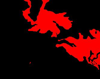
Thus, only those cells that are colored (1) in both maps make a product score of 1. These form continuous patches, colored red, in the BESTSORG map produced by OVERLAY shown here:
Since we know the area of each cell, the total area associated with suitable conditions is just the product of the number of cells times the unit area. In IDRISI, the two programs GROUP and AREA do this.
15-11: Examine this BESTSORG map carefully. What is controlling the distribution pattern of the red that represents the optimum crop growth conditions? ANSWER
Of course, we would include many other attributes and thematic factors in a real suitability case, as for example: Access (roads, etc.), Market Requirements, Fertilizer Needs, Manpower Availability, etc. We express some of these factors as maps and others as data that we may organize into value tables. We can integrate these data in GIS models that add to the scores in each data cell. And, as we showed in the Site Suitability illustration above, we could apply a different system of ranking, in which we associate a range of rankings, say, from 1 to 10 (rather than just 0s and 1s), with each cell, and then sum them for all the data elements.

Primary Author: Nicholas M. Short, Sr. email: nmshort@epix.net
Collaborators: Code 935 NASA GSFC, GST, USAF Academy
Contributor Information
Last Updated: September '99
Webmaster: Bill Dickinson Jr.
Site Curator: Nannette Fekete
Please direct any comments to rstweb@gst.com.