
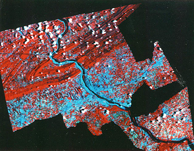
The PP&L data sets were somewhat dated, having been acquired over a period of years. One of the main contributions from Landsat was to provide an updated land-use map. From this Multispectral Scanner, false-color composite, a "cookie-cut" section appears, which represents the service area for locating the site:
We ran this June 1977 scene through a supervised classification, in which we selected training sites from other data bases and field observations. This map resulted
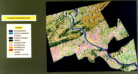
15-17: Compare the Landsat map with the PP&L map on the previous page. What are the main similarities; the main differences? What factor(s) are largely responsible for the differences? ANSWER
Drawing upon the PP&L data elements, and the updated classification, we then applied a site-selection model, developed particularly for this study, to the data base. We chose six of the 43 elements as the primary criteria for establishing suitability: (1) Landforms; (2) Groundwater Supply; (3) Soil porosity; (4) Ease of Excavation; (5) Foundation Stability; (6) Distance to Surface Water (limits: 15 cells maximum linear distance). We added other factors, including several socio-economic ones, as secondary determinants.
The next illustration uses single colors (against a yellow-gray background with the river in blue as a location reference) to mark areas derived from the model analysis that were acceptable or unacceptable under the set conditions.
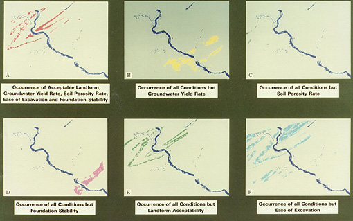
Panel A highlights areas (red) of high acceptability under all conditions. In B, the yellow area denotes unfavorable groundwater. In C, the few blue dots point to areas subject to unsatisfactory porosity infill rates. The purplish-red area in D refer to an unacceptable area because of foundation instability. The green in the E panel associates with landforms, in which slope steepness rules out any use for a site. F contains large areas in light-blue that relate to difficult excavation.
We combined these elements, along with others, to produce a Best Site map, made by creating a binary mask (0s and 1s for reject or accept) for each data plane and then adding them to form this composite image:
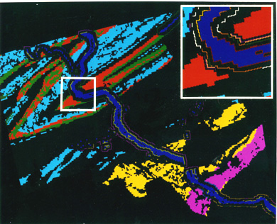
Note that only one small area (the white square, with enlarged details in the inset) broadly meets all these conditions and the constraint of proximity to a large surface water supply (an avenue for discharge of waste water). This area is a lowlands, just south of the junction of the Juniata River with the Susquehanna that is high enough to avoid most floods. It lies between the frontal Blue Mountain (south) and Mahony Ridge (north). Although organizations use much of the surrounding area along Route 11-15, the immediate area selected for the site has only two small towns, Duncannon and Perdix, on either side and still has open lands amenable to development. A good supply of labor is nearby, including Harrisburg, whose northern suburbs are about 10 km (6 mi) away.
Admittedly, the above example is a rather simplistic exercise. But it does illustrate the manner in which GIS supports various modes of decision-making. It also demonstrates the role of timely space imagery in the process.
15-18 Critique this Best Site final product. Is it convincing? ANSWER
If you are new to GIS, you now should know enough to begin practicing on your own. There is a web site, sponsored by the Research Program for Environmental Planning and Geographic Information Systems (REGIS ), a group of geographers at the University of California at Berkeley, that has data sets (maps, aerial photos, and space imagery) of the San Francisco Bay Area, which you can display, combine, and use to output new products. This is the BAGIS program, done with a version of GRASS, called GRASSlinks, developed at UCB by Dr. Susan Huse and her colleagues. It's fun and a challenge to work with. Access it here (http://www.regis.berkeley.edu/gldev/regis.html) and follow the instructions to build your skills at deriving meaningful maps. Links at this site also guide you to other projects by this group.
In the last two decades, GIS has burgeoned into a major international industry. It has become the tool of choice for many applications of map-based, spatial data to problem solving in the Information Age. Its emergence has largely paralleled that of remote sensing and the two aid each other symbiotically. In the GIS realm, remote sensing contributes a subset of input data, whose value is mainly in updating land-cover types. As a measure of the import now attached to GIS, it has grown into a staple of the geography curricula in our colleges and is probably more widely taught than remote sensing.

Primary Author: Nicholas M. Short, Sr. email: nmshort@epix.net
Collaborators: Code 935 NASA GSFC, GST, USAF Academy
Contributor Information
Last Updated: September '99
Webmaster: Bill Dickinson Jr.
Site Curator: Nannette Fekete
Please direct any comments to rstweb@gst.com.